Choosing New Colors for my Website
Oct 1st, 2020
997 words (~5 minutes)
I never quite understood how to use colors. I can appreciate them when used well; Blade Runner 2049 was my favorite movie for a while because of its striking palettes. La La Land still is my favorite for the same reason. But if you asked me to come up with my own palettes, I’d either be baffled, or would choose the loudest combinations you’ve seen.
When I first started my website in late undergrad, I stuck with simple colors. White background, black text, supporting a dark blue ⬤, heavily inspired by Google’s Material Design.
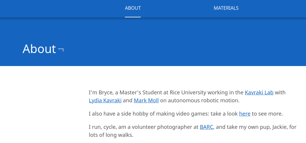
After a few years in grad school, I realized that I needed a ‘brand’: some consistent visual aspect to my online and professional presence. I first started deciding on colors to use in my ‘brand’ in some presentations , and then redesigned the website around them.
The colors were:
- a bright blue ⬤ used as the primary background and theme:
- a crazy bright yellow ⬤ to counter the blue
- a dark purple ⬤ whenever an accent was needed
- white ⬤ for text
I honestly just went with these because:
- They stood out amid a web of black text on white backgrounds. I just wanted to be a bit more unique, the true snowflake I am
- They’re fun! Bright colors are just fun for me! I’m by no means a designer by trade, just by hobby. Making my website appeal to anyone but myself wasn’t necessary.
However, eventually the colors started to wear on me.
I posted Visioning Texts on Reddit early this year, and got quite a bit more attention than I was expecting. While there were a lot of garbage comments, the most constructive ones were related to the color choice:
- “The blue background is extremely hideous”
- “It’s just too much of a harsh contrast. Makes it difficult to focus on the data”
- “Colour palette could do better. Blue and yellow remind me of IKEA”
At first I brushed it off for the same reasons: it’s my project, I can do what I want! And that’s a perfectly valid response! I could have just left it. But in the back of my head, I knew that I choose these colors knowing completely nothing about color theory, or even just the basics outside of RGB. I had no idea what HSV was, and my main color choosing method was the Material design website and fiddling with hex values.
After coming across several great articles and videos, I got the motivation push to actually put some effort into my colors this time.
The Actual Work
I wanted to keep the same amount of fun with my new color choice, while being a little easier to read and just a simge more serious. I found the idea of copying palettes from Movies particularly interesting, so I skipped through some movies/TV shows on Netflix to scenes I remembered being striking, and grabbed a few screenshots [footnote 1].
I threw all of the screen shots into a collage, and was surprised with the results. I thought I had grabbed more scenes with blues in them, but the only one present was a scene from Neon Genesis: Evangelion.
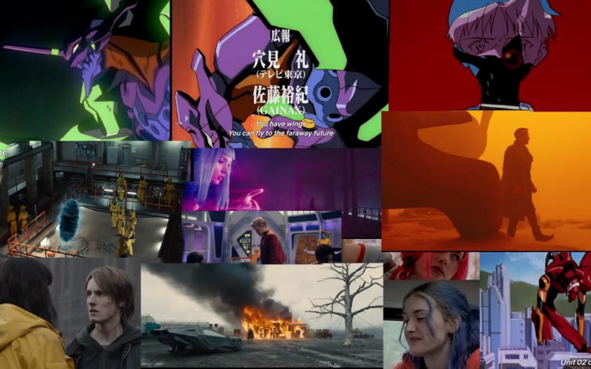
On a whim, I generated a palette from it (on Canva), and got:
- Woody brown: ⬤
- Whiskey: ⬤
- De York: ⬤
- Deluge: ⬤
I played around for a long time in colorizer and coolors adjusting brightness values and occasionally the cyan/yellow scales to make sure the colors would still be distinct for colorblind people and got … something.
Which wasn’t the worst, but still seemed disjoint. It clicked after my girlfriend pointed out to me that the individual images didn’t have that much in common. I was hoping that I’d just get colors that I liked by putting the images into a collage, but that wasn’t the main point of choosing new colors.
I then just made color pallets of each individual image in the collage and came across a second issue of taking colors from stills of films: the checkered shadow illusion: the actual color values in the image aren’t colors that your brain is interpreting. For example, the bright yellow rain coat in Dark is a staple in the series. In my mind, it always seemed so bright, the only bold color in a sea of washed out grays. But the direct sample from the image was ⬤. Ew.
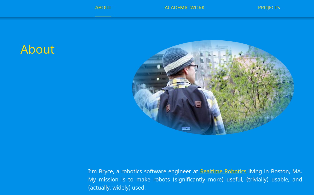
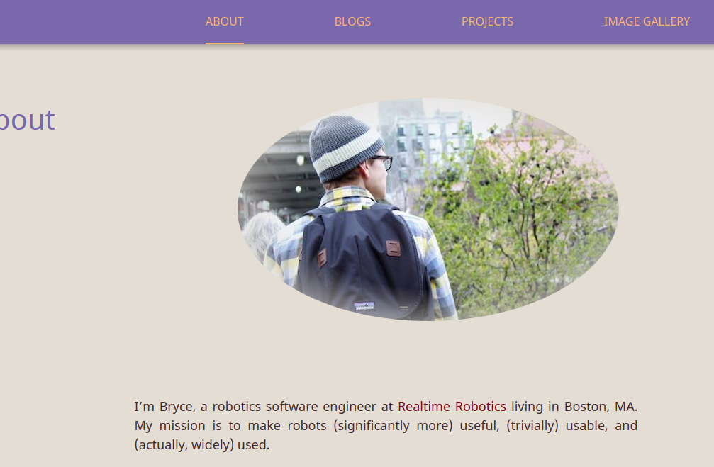
Not a ton of the screen shots worked when trying to extract a usable pallet, so I had to mix and match a bit. I combined some of the colors from Blade Runner: 2049 and Evangelion to get the final colors you see here:
- A blue grey ⬤ background
- A green ⬤ and variant ⬤ for links (before and after visiting)
- A dark purple ⬤ for the nav bar and body text
- A lighter fuchsia ⬤ for nav bar text
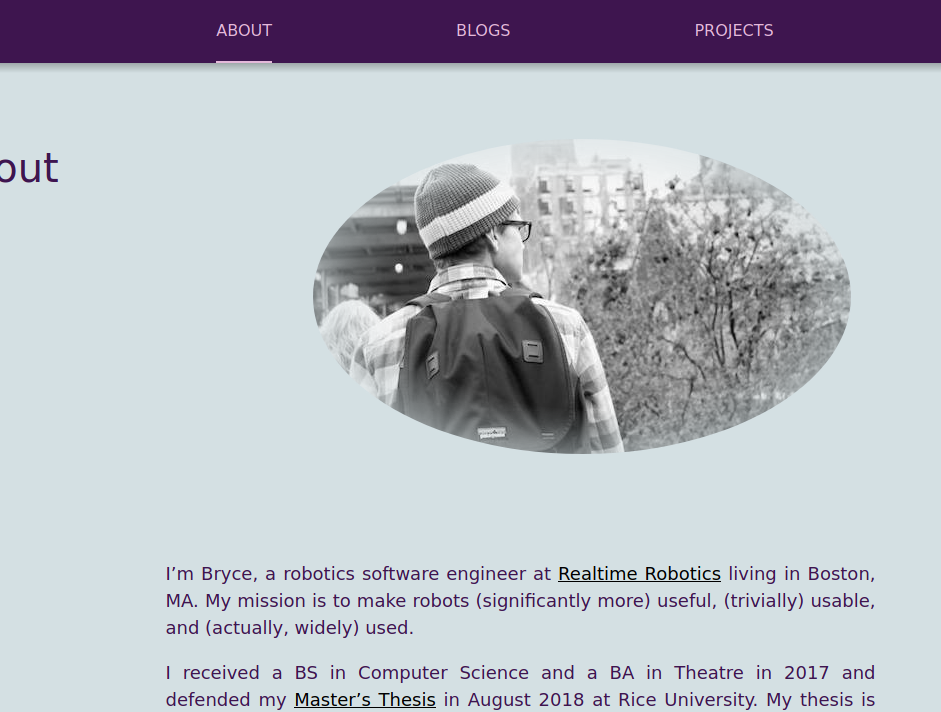
I also made the header images grayscale to make them smaller (faster load times) and to blend better with the grey background.
My main takeaways?:
- Don’t be afraid to copy color palettes.
- Don’t take too much inspiration from too many places.
- As with everything, keep iterating til your happy, never just try one or two.
-
The list was Dark, Neon Genesis: Evangelion, Black Mirror (USS Calister), Blade Runner 2049, and Eternal Sunshine of the Spotless Mind. Took about 40 minutes to skip through the episodes/movies and grab the screen shots. [go back to reference]