Web Accessibility Standards
Nov 25th, 2022
3323 words (~16 minutes)
Over the past 6 months or so, I’ve been leading a lot of work to make docassemble and our e-filing guided interviews more accessible. To do it I had to read a lot of different standards, which were really confusing at first. I wrote this post to try to summarize some of those standards at a high level, because diving straight into standards without context sucks, and trying to consume every linked to resource before reading a standard also sucks.
What is accessibility?
Pretty much everyone uses digital technology now. And that means everyone: people with low vision and blindness, people who are hard of hearing or deaf, people with ADHD or dyslexia, and many others. Notably, if you can name some way people can interact with technology (looking at a screen, using a mouse, etc.) there is a group of people (who’s population size would likely surprise you) that can’t interact in that way with technology.
Accessibility [footnote 1] is making technology flexible enough to be interacted with in many different ways. That’s it. The hard part is in the details of what that means though.
Web accessibility is a bit more focused; to view web content (say, this blog post), you’re probably using a web browser like Chrome or Firefox. However people also use other software, called assistive technologies or “user agents” in the standards, to help them view the content. Those technologies range from things like screen readers, Braille displays, and auto-captioning tools, to eye trackers, voice recognition, and on-screen keyboards. These assistive technologies use the accessibility interface exposed by operating systems and browsers to transform web page content into something that can be perceivable and operable by those tools’ target audience.
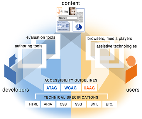
Accessibility as relationships between developers, users, and content
There are three labeled corners: website elements labeled 'content, are at the top, 'developers' are on the left, and 'users' are on the right. A path connects 'developers' to 'content', through 'authoring tools' and 'evaluation tools'. Another path connects 'users' to 'content', through 'browsers, media players' and 'assistive technologies'. There is a list of accessibility guidelines (ATAG, WCAG, and UAAG), and a list of technical specifications (HTML, ARIA, CSS, SVG, SMIL, etc.) connecting to authoring tools, content, and browsers.
The best way to access same content from varying technologies is to use standards. In this post but when I say “accessibility”, I’m talking about web accessibility standards.
However, don’t forget about the root purpose of those standards: the users. Standards are the result of general accessibility user testing over lots of different types of web apps. However, your website can still be perfectly coded to web accessibility standards, but still not be accessible. User testing with your specific web app is the only way to find and fix those gaps.
Accessibility Standards
I’ll focus on three standards in the rest of this post:
- WCAG: Web Content Accessibility Guidelines, the web accessibility standards themselves
- the DOM: Document Object Model, how web pages are structurally organized
- ARIA: Accessible Rich Internet Applications, a set of features that you can use to more directly control the accessibility experience of a web page
I assume a little bit of knowledge about some other important standards, including:
- XML: eXtensible Markup Language, just a structured way of organizing data by a tree
- HTML: HyperText markup language. The backbone of the internet, and what every web page is written in
There are also a ridiculous number of acronyms that you’ll see going through the different documents and standards. Here are the ones you’ll see often:
- WCAG-EM: WCAG Evaluation Methodology, how to systematically apply WCAG to your website (I’ll cover this in a different post)
- W3C: World Wide Web Consortium, the group that develops these accessibility standards, like WCAG and ARIA, and other web standards, like CSS
- WAI: Web Accessibility Initiative, the group responsible for developing all of the W3C’s accessibility standards and documents
- WHATWG: Web Hypertext Application Technology Working Group, a separate group that just makes the HTML standard
- TR: Technical Reports, it’s in most of the web standards’ URLs
- ATAG: Authoring Tool Accessibility Guidelines, the standard for authoring tools to generate accessible content. Authoring tools are any tool that helps you, the author, generate web content, from what-you-see-is-what-you-get HTML editors, to social media post editors.
WCAG
WCAG are the standards themselves, the bible. It is broken up into individual testable statements, called success criteria.
Each criterion is something about the website that can be true, e.g.
Labels or instructions are provided when content requires user input
.
There are several versions of WCAG. You should probably use the latest, WCAG 2.1, but it helps to understand that each version expanded to incorporate the technologies of the time it was written and new groups of people with disabilities. For example, WCAG 2.0 came out in 2008 (think early Youtube and Facebook years), so it emphasizes “dynamic Web pages… including ‘pages’ that can present entire virtual interactive communities.” WCAG 2.1 came out in 2018, so the technical focus is on mobile devices, but also emphasizes cognitive disabilities and low vision. There’s some ongoing (as of November 2022) work on a WCAG 2.2, which includes additional parts on focus and authentication, and a much more radical change in WCAG 3.0, which focuses much more on user-centered research and testing, but isn’t quite finished yet.
Each success criterion also has a conformance level, either A, AA, and AAA. The conformance levels are how hard it’s considered to do what those statements say: A for the easiest statements, and AAA for the more difficult statements. WCAG itself says that it is not possible to satisfy all Level AAA Success Criteria for some content
.
I like to think of conformance levels as mission rankings in Sonic. You need to hit the bare minimum conformance level to have an accessible website, but in general, you can also do better.

If you are a developer interested in making accessible web content however, WCAG isn’t going to be enough. The issue is mentioned right in the first paragraph of WCAG 2.1:
WCAG 2.1 success criteria are written as testable statements that are not technology-specific. Guidance about satisfying the success criteria in specific technologies, as well as general information about interpreting the success criteria, is provided in separate documents.
I.e., reading WCAG doesn’t really help you write accessible web content; it tells you what your final website should do, but not how to get there. You have to read these “separate documents” for that:
The DOM
To understand accessibility, you need to have a good understanding of the DOM and the accessibility tree.
The DOM stands for “Document Object Model”. It’s a way to describe, access, and modify XML and HTML documents.
It’s a tree of nodes, each of which directly map to an HTML element like body or div.
The HTML DOM gives specific meaning to some attributes, like class and id. It also defines what’s valid DOM, like requiring all children of an unordered list
to be list items.
Turning HTML code into a tree of nodes
There are 6 nodes in the tree, each with arrows pointing towards their children. At the top, "HTML" has two children, "head" and "body". Body has only one child, "ul", or unordered list. The unordered list has two child, both are "li"s, or list items.
<html>
  <head>
  </head>
  <body>
    <ul>
      <li>One option</li>
      <li>Another option</li>
    <ul>
  </body>
</html>

From the HTML DOM tree, browsers make an accessibility tree. Each node in the accessibility tree can have:
- an accessible name
- the full description
- the semantic role, like text input or nav bar
- a given state, like expanded or collapsed
The accessibility tree is the structure that assistive technologies actually use.
ARIA
Accessible rich internet applications (ARIA) is a standard that gives you full control over how accessibility technologies read and understand a web page.
ARIA gets it’s strength by directly influencing the accessibility tree. By using ARIA,
the accessibility tree can be modified for certain features and widgets. For example, an element whose role is set to "presentation" won’t be present in the accessibility tree, and thus isn’t visible to screen readers and keyboard users.
ARIA gives you so much control that in several places in the ARIA standard itself,
you are warned against using it: no ARIA is better than bad ARIA
. However, given how much web development is a series of divs and spans,
it’s still necessary if you are writing anything interactive.
ARIA has 3 key parts: roles, states and properties.
Roles apply HTML element semantics to completely different elements. For example, you can include <div role="paragraph"> in a
page, and the accessibility interface to the page will treat it like it was a p element instead. Sometimes there are ARIA roles that don’t exist as HTML elements, like "progressbar" or "tree"[footnote 2].
Roles also give hierarchial and contextual information about the element (for example, "listitem" are in "list"), and also determines which state and properties that the element can have. Once a role is assigned to an element, it cannot be changed; you have to delete the element (and all of it’s children) from the DOM and create a new element with the role that you want it to have.
State and properties both let people know what elements might change or be updated on the page. The standard itself mentions that states and properties are a bit difficult to distinguish, but the main idea is that states are expected to change often, and properties are expected to change less often. However, in practice, properties can change more than states, so the distinction is sometimes ignored.
If you aren’t writing full widgets yourself, the most useful things to know about ARIA are the general idea and its terms. You’ll likely run into ARIA in the wild when doing automated accessibility audits if another developer didn’t follow the rules for roles and states correctly. For example, using the aXe automated accessibility checker can send you to the Deque University site for an issues with the presentation role, or an issue with the accessible name for a progress bar. You’d need to know what a role is, what the presentation and progressbar roles are, and how to properly name an accessible element. That’s the most practical way to learn the details of ARIA.
Real-life Example: Comboboxes
Since my biggest obstacle when learning about accessibility standards was actually figuring out how to apply them when writing web pages, I thought I’d give an example of when I used them often: improving the built-in combobox widget in docassemble [footnote 3].
What you can do with a combobox
The video shows a sample combobox, with a button. When the button is pressed, 5 options are shown in a listbox below the combobox input, and one is selected directly by a mouse. Pressing the button then clears the input. Finally, something in directly typed into the combobox, and only the options that contain the letters typed so far are shown. "Yharnam" is typed, and the options "Central Yharnam" and "Old Yharnam" are shown, followed by "Cath", which shows "Cathedral Ward".
Comboboxes are a combination of a text box and a drop down. It looks like a text box, but when you start typing into the box, a list of possible options that match what you’ve typed so far appears below it. You can select one of those options, or you can type your own option that isn’t available in the textbox, and submit a different value [footnote 4].
Comboboxes need to focus on a few accessibility key points:
- keyboard controls need to be consistent
- accessibility tools need to be alerted when the list of matching items first appears and when it’s contents change
Unfortunately, the existing implementation lacked attention to both of those accessibility key points. It didn’t use much ARIA at all, and was completely inaccessible to screen readers. The ARIA design pattern example goes a long way to remedying these issues, and was the basis of this change.
Let’s break down each part of the new combobox and its improvement.
The Textbox
First, we have the text input itself:
<div class="input-group">
  <input type="text" id="combobox" autocomplete="off"
      required="required" placeholder="Select one"
      role="combobox"
      aria-autocomplete="list"
      aria-expanded="false"
      aria-activedescendant="opt-Cathedral Ward"
      aria-controls="combobox-menu"
      aria-owns="combobox-menu"
      aria-invalid="false">
  ...
</div>
The key line here is role="combobox". This gives the element the semantics we want; specifically that it is a text input box that controls an associated listbox.
It also defines the states and properties that the element can have (i.e. the rest of the attributes mentioned below).
aria-autocomplete="list"marks that this combobox is predicting the user’s input, and that the predictions will be put in a list. Note that there is similarly named but different feature,autocomplete, which we set to"false".autocompleteprevents the browser from suggesting inputs, like saved passwords and addresses.aria-expandedis a state that marks whether the associated listbox is expanded, or visible. It’s a state since it’s expected to change often in normal operation.aria-controlsandaria-ownsboth contain the id of the element thataria-expandedrefers to.aria-activedescendantidentifies the current choice of the user in the listbox, while keeping the browser focus on the combobox itself.
The Listbox
<div class="input-group">
  ...
  <ul role="listbox" id="combobox-menu">
    <li id="opt-Cathedral Ward"
        role="option" aria-label="Cathedral Ward"
        aria-selected="true">
      <b>C</b>athedral Ward
    </li>
    ...
  </ul>
  ...
</div>
aria-selectedmarks the specific element that is the current choice, which most screen readers will read out directly.- Each option has an
aria-label. To show the users why a specific item is predicted, the letters it shares with the input so far a bolded. Even though we use<b>to indicate that the text is only formatted and not semantically separate from the surrounding text, some screen readers think that the text inside the bold tag is a different word. Those screen readers will read what’s inside and outside of<b>as separate words, making it incomprehensible. Adding anaria-labelthat is directly the text of the item prevents this issue.
The Button
The last part of the combobox is the button. This is for people who use the widget without typing, just with a mouse, and can open and close the listbox. It’s HTML looks like:
<div class="input-group">
  ...
  <div class="input-group-append">
    <button type="button"
        tabindex="-1"
        aria-expanded="false"
        aria-controls="combobox-menu">
      <svg data-icon="caret-down">...</svg>
    </button>
  </div>
</div>
Since you can already accomplish the main purpose of the button with keyboard controls, it doesn’t make sense to include it when navigating the
page with only keyboard controls. We set tabindex to -1 to take it out of the tab order of the page so it isn’t accidentally triggered, confusing keyboard-only users.
Ending Thoughts
This post focused on learning the low level details of accessibility standards. However, knowing accessibility standards and trying to apply them systematically to your website are very different tasks. How to actually do an accessibility audit on a full website (and some smaller steps you can do to improve your website’s accessibility) will be in another post, coming soon.
-
Accessibility is sometimes shortened to
a11y, because there are 11 letters between the starting ‘a’ and ending ‘y’. You might see a similar shortening of internationalization toi18n. [go back to reference] -
In fact, the existence of ARIA is supposed to encourage the development of new, more semantic host language features in HTML and SVG. [go back to reference]
-
If you read the description of the pull request I made to Docassemble, these improvements are still lacking on certain OS and browser combinations. So be warned. [go back to reference]
-
The fact that comboboxes let you type in any value, not just the suggested options, is important in docassemble. To implement a feature like that without a combobox takes two separate fields: a dropdown with an “other” option, and a text box that appears only if “other” is selected. It’s yet another field the form user, and it also adds additional complexity to the docassemble code on the backend. [go back to reference]